
Explore the visual language of punk rock in Moore’s Pretty Vacant exhibit
At the end of the summer of 1977, Andrew Krivine came home from his annual vacation with more than just a few tacky souvenirs to show for his time abroad.
In England to spend time with his aunts and uncles, the 16-year-old high school junior was made the responsibility of his cousin John, who ran a pair of London boutiques, Acme Attractions and BOY. These were favorite hangouts for members of the burgeoning punk scene. Krivine recalls walking into BOY that summer and hearing The Clash’s debut album playing over the shop’s speakers.
“I remember thinking at first, ‘This is just noise. The guy can’t enunciate, and this is really irritating me,’” Krivine says. “It was all very alien and kind of scary to me. But by the second or third day it flipped and I realized this was an amazing record. I fell for punk very quickly.”
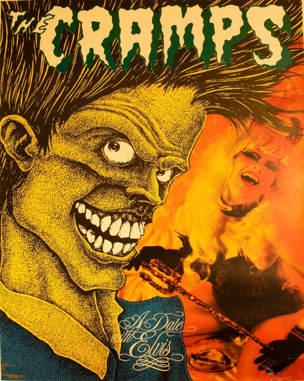
A poster for The Cramps’ 1986 LP A Date With Elvis
That initial infatuation with the music turned into a mania for collecting all manner of ephemera related to the punk rock movement. Krivine’s collection now serves as the basis for Pretty Vacant: The Graphic Language of Punk, an exhibition at Moore College of Art & Design that opens on Friday. The show traces the art of punk through hundreds of posters, flyers, fanzines, record sleeves, badges and buttons, spanning from the early ‘70s through the mid-80s.
In addition, the college will host a number of screenings and other events over the next month and a half, including a Feb. 26 screening of The Blank Generation at International House with co-director Amos Poe in attendance.
The show was a labor of love for Moore chief curator Kaytie Johnson, who was involved with the punk scene in Phoeniz, Arizona in the late ‘70s and early ‘80s. “This is probably the most personal show I’ve ever done,” Johnsons says. “I think that a lot of us are really sick of this slick commercial culture and it’s nice to return to this really raw stuff that breaks the grid apart.”
Johnson sees the imagery of punk rock as “a visual code. I think that the punk aesthetic, if you want to call it that, really encapsulated the social and political climate, especially in London in the early days. I think it captures the energy of the music, too. It served as a visual code and signifier that those who were in the know could immediately recognize. So I think it’s just as important as the music in many ways.”
Getting involved with the scene through his cousin’s boutique meant that for Krivine, the look of punk was always inextricably intertwined with its sound. “It was outrageous, it was very colorful, it was a complete break with what came before,” he says. “It was very primitive, aggressive, and humorous, and you see those elements in the graphics. In that same period, the whole prog rock thing was going on, and you had those artists who did very flowery designs for Pink Floyd and Yes. Punk was so different, so opposed to that. I was instantly attracted to it.”
Krivine returned home to Westchester, New York after that first summer with a convert’s zeal, hoping to proselytize the States for the cause of punk. “I came back and bought zipper t-shirts, bondage shirts, really outrageous stuff,” he recalls. “Fortunately it was a really milquetoast suburban setting so I didn’t get mugged by my classmates; they kind of tolerated me. I’d lived there all my life and was very well-grounded, so nothing ever really happened, but I didn’t inspire many people outside of a few classmates. I really thought punk was going to take over here but it never did.”
That first summer had netted Krivine a batch of flyers and fanzines, but by the next summer fandom had evolved into a serious instinct for collecting. He haunted London record shops as well as labels like Stiff and Virgin for whatever materials he could get his hands on. In the decades since, his collection has grown to nearly 2000 pieces, threatening to overcrowd his Manhattan apartment.
 The exhibition at Moore, which follows a show of Krivine’s collection at New York’s Steven Kasher Gallery in 2011, includes work by graphic artists including Jamie Reid, Barney Bubbles, Raymond Pettibon, and Linder Sterling for bands like the Sex Pistols, The Clash, the Ramones, Black Flag, the Buzzcocks, and Joy Division.
“In many ways,” Johnson says, “the punk scene was the kernel of the DIY movement. For the most part it was learn three chords, let’s start a band, or let’s cut some stuff out from a newspaper, glue it on a piece of paper, Xerox it and here’s our fanzine. I think it’s interesting to revisit because there’s a return to DIY practice right now.”
As both Krivine and Johnson point out, however, the bold, aggressive look of punk was as much a product of modern art as of its handmade origins, involving some of the era’s most gifted graphic artists. Krivine points to objects in his collection including a rare, quickly withdrawn Sex Pistols poster by Jamie Reid that parodied an American Express card, or an image for The Jam’s “’A’ Bomb in Wardour Street” single that echoes the work of Roy Lichtenstein.
“With punk design there’s a very facile DIY notion that it’s all about kids doing mimeographs with ransom lettering,” Krivine says. “That’s an element of it, but what’s cool about punk graphics is that there’s a mixture of kids in the bands doing their own work and then people who were art school trained who were so inspired by punk that it brought out their best work.”
Supporting that opinion, nearly 200 items from Krivine’s collection were recently acquired by the Museum of Modern Art. He expects that a number of exhibitions will spring up in 2016, which will mark the music’s 40th anniversary.
While it’s thrilling to see all of this material gathered in one place, it doesn’t take a gallery show to reveal the influence of the punk aesthetic on modern culture. “Once people see all the work together, they’re going to realize that it’s a big part of graphic design,” Johnson says. “People will see that it’s influenced so much stuff that’s going on today in a design sense. In a way, it really encapsulated and epitomized post-modern graphic design. It was a game-changer, and I think it lingered and it was appropriated by mainstream culture. It says something about how potent it was that it was appropriated by the powers that be.”
For Krivine, who supports his collecting habit with a day gig as a commercial banker, this material is a way to recall one of the most meaningful periods of his life. He excitedly recalls seeing The Clash at their prime, or catching a Dead Boys show at CBGB where John Belushi sat in on drums during “Sonic Reducer.”
“Punk changed my life,” Krivine says now. “It was what I was looking for but didn’t know at the time until I heard it and saw it.”
Pretty Vacant: The Graphic Language of Punk opens Friday January 24th at The Galleries at Moore, 20th Street and the Parkway, with a reception from 6 to 8 p.m. The exhibition runs through March 15th