Perry Shall | photo by Alyssa Tanchajja | courtesy of the artist
How Philly’s Perry Shall went from basement show punk to in-house artist for Dan Auerbach
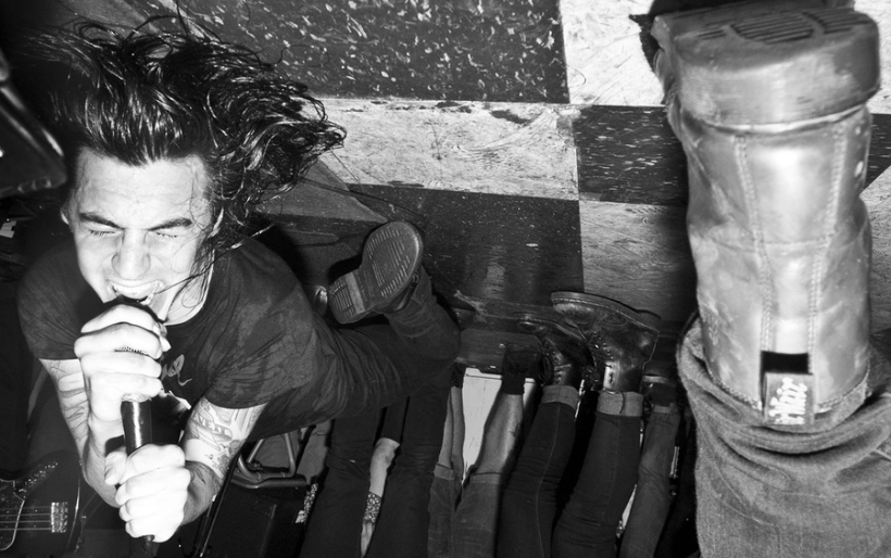
You might not know Perry Shall by name, but if you’re a music fan in Philadelphia, you’ve almost certainly heard the longhaired rocker in one of his many bands or seen his art gracing the albums and t-shirts of some of your favorite acts. You might have even heard him on WFMU’s The Best Show – he has the show’s slogan WE GET IT / THEY DON’T tattooed on his wrists – or seen the wildly popular SuperDeluxe video about his immense vintage t-shirt collection, 1400 and counting.
He is the very definition of a man about town, though these days that town isn’t just Philly: Shall has been doing much of the art and design work for Nashville-based label Easy Eye Sound, run by Dan Auerbach of The Black Keys. Don’t worry, he’s not leaving us for the Music City. You’d be hard-pressed to find someone who loves this city as much as Perry does and I suspect he’ll never live anywhere else.
One of the most recent things he did for Easy Eye is the album art for a long lost Link Wray song “Son of Rumble” that’s being put out on a 7″ record in April. Yes, that Link Wray, the late surf guitar legend who first rose to popularity in the 1950s. Shall was as surprised as you might expect when he found out that was happening. He was on tour with his band Hound – which includes Chris Wilson (Ted Leo and the Pharmacists) and Pat Hickey (Purling Hiss) – and while in Nashville, they stopped by Easy Eye. He noticed a board in the studio that had Wray’s name on it and asked Auerbach, “Why does this say Link Wray?!” and he replied, “We’re going to do a Link Wray [single] and you’re going to do the art, obviously.”
Other Easy Eye releases that Shall has done covers for include Auerbach’s 2017 LP Waiting On A Song, as well as releases by Shannon and the Clams, bluesman Robert Finley, amongst others. Asked about his partnership with Shall, Auerbach told The Key that, “We strive to make something that looks and sounds timeless. We don’t want to be mired in the past or worried about any new trends. We’re steadily creating our own universe based around the studio, which very much has its own sound feel. So, we wanted a design aesthetic to go along with that sound. It’s a work in progress but that’s half the fun.”
This has been Shall’s life for the past year, and to hear him describe it he’s equally shocked, humbled, and super excited for whatever happens next. The most recent Hound album, Born Under 76 – which for the sake of journalistic integrity you should know that this reporter played approximately five seconds of saxophone on – is absolutely fantastic and his art has been showing up everywhere from on stage at the final Modern Baseball shows to an episode of Jimmy Kimmel Live with Auerbach on as the guest.
But these sorts of successes don’t happen overnight. Shall has been deep in the DIY trenches since he first started making art for bands 15 years ago when he was a teenager in Northeast Philly. We recently sat down with Perry for an extensive interview about his art, his work for Easy Eye Sound, and his music.

Perry Shall’s design for Dan Auerbach’s Waiting on a Song | courtesy of the artist
The Key: I imagine you as a kid just constantly drawing logos for bands, either real or made up.
Perry Shall: Oh yeah, definitely. If I saw something that was a cool looking logo, like I’m sure the Metallica logo or stuff like that, I would definitely be drawing [it]. Very Beatles heavy. When I was a kid, besides a little kid doodling with crayons, which I did obviously, once I started getting into music it would be The Beatles. I would try and draw pictures of the members of the band. Dookie from Green Day, I remember drawing elements of all the cover art.
I figured out how to draw Fred Flintstone and Kermit the Frog [in] third grade. You know what’s funny? In first grade we had an art class and we got in the classroom and there’s all these drawings of clowns. I guess the teacher was going to walk us through step by step how to draw the clown. When I sat down and she said we were going to draw clowns that day, I just started drawing the clown and drew the big collar and all that stuff. I just went for it. I remember I got in trouble because I just started without the teacher because I just wanted to draw this clown. That was first grade.
I wasn’t a bad kid; the teachers liked me and I was nice but I wasn’t good at school. I remember in fourth grade the teacher called me out in the middle of the class because, instead of paying attention or taking notes, I was practicing drawing Kermit the Frog. And when you’re in fourth grade, it’s almost not cool to care about Kermit the Frog.
So she called me out in the middle of the class and held up the paper and was trying to embarrass me – well, she did embarrass me – by showing the whole class [and saying], “What are you doing? You’re not supposed to be drawing these cartoons or Kermit the Frog or whatever!” But I remember thinking about it and being, like, “Well, I did a really good drawing of Kermit the Frog. I did it. I’m embarrassed and I feel bad but she can’t take that away from me!”
TK: Were you getting in trouble a lot?
PS: I wasn’t getting in trouble too much but I really never [cared about school.] I wish I kept all my notebooks because they’d all be drawings. I would fake take notes: I would convince myself if I did it in the beginning when we first started, maybe it would be enough, and then the next thing you know [it’s] halfway through the class and I’m looking at my paper and I’m, like, “I just drew. I didn’t take any notes.”
We would have to do journals in sixth grade and I would literally scribble so it looked like words. So if somebody walked by to check, it would look like something, as if I had really sloppy cursive, but I would just be drawing. School House Rock characters. Any cartoon I would be watching at the time. Beavis and Butt-Head. I was obsessed with drawing Beavis and Butt-Head. Ren and Stimpy. Always Mickey Mouse cause I’m, like, “If you can get Mickey Mouse figured out [then] you can draw everything, because everything is based off of Mickey Mouse.” Bugs Bunny. Every cartoon character that I was obsessed with at the time.
TK: Did you want to be an artist when you grew up?
PS: I wanted to be a puppeteer for a long time. And I don’t necessarily want to be one now, but I’d like to maybe toy around with maybe making a puppet or something. Because I was obsessed with Sesame Street and all the Henson stuff and Peewee’s Playhouse and Alf. I really loved the idea of it: I could be artistic and build stuff and do these voices and characters. It was almost a little bit of a bunch of stuff I liked. At some point I never pursued it but I kept drawing.

Perry Shall performing in Stu-gotts | photo via Stereokiller
TK: When did you start your first band? In high school?
PS: I started taking drum lessons in 4th grade. One of my friends came into class and said, “Hey, we need somebody to play drums in the music department. Does anybody want to do it?” Literally walked in and said it to the whole class. And without thinking I just raised my hand because it was, like, “What, we’re getting out of class?”
I loved the Beatles so I was, like, “I love Ringo! Sure, I’ll play drums.” So I started playing snare drum. And I played snare drum for the next two years and then in middle school I started taking lessons. In 7th grade the teacher left and I stopped for two years until I went to high school and my best friend’s mom said, “You’re going to go to band camp, right?” And I was, like, “Band camp? What are you talking about? I haven’t played music in two years.” She said, “You should go!” and so I went and they put me on cymbals. Eventually they moved me on to bass drum and then I was taking private lessons with a [full] drum set.
But in 9th grade a friend of mine was in one of the practice rooms playing guitar and I walked in and he was playing “Blister in the Sun” by Violent Femmes. Then he showed me how to play it. I was like, “That was pretty easy.” Next thing you know I’m starting to play guitar more and more. I played guitar in jazz band at school – not well. Then I played electric bass in marching band in 12th grade.
In 2001 or so, we started playing music, me and two friends. I was 16. That was when I was like, “Okay, I think I play guitar now.”
TK: Your hair got slightly longer?
PS: No it didn’t! It was getting shorter at that time. I was shaving my head. That was when I was really starting to play music. My friend’s older brother was playing in a punk band and so I started going to see them at the bowling alley in Northeast Philly.
TK: Which bowling alley?
PS: Thunderbird Lanes. I’d go see them play all the time. I would doodle pictures of them because it was like, “It’s cool, there’s a punk band I’m friends with!” So I would draw these pictures and I would make up logos and give it to them. I really wanted to make art for a punk band.
At the time I remember they were still, like, “We don’t know how to make shirts.” So I said, “Come to my house and we’ll make an iron-on [design] and you’ll make a bunch of shirts.” I don’t think they made any of the shirts.
Eventually that group of kids graduated from my high school and we [started] doing our own thing. We would screen print our shirts at the high school in the graphic design class, which I didn’t have but I met the teacher so we could do it.

Perry Shall’s first band logo, for Stu-gotts | via Purevolume
TK: So the first band logos you made that were being used were for your own band? What were you called?
PS: I guess as far as ones that were actually getting used, for sure. [The band] was called Stu-gotts. It’s an Italian curse word. We saw it on a license plate and my friend’s dad was freaking out because he didn’t know what it meant.
It was one of those things where I was already drawing band art before we had a band. We would make up fake band names or an idea of a band that me and friends were going to start. Before that we’d have band practice where we’d learn a bunch of cover songs and then one of the members was too busy on that weekend so we started a different band.
At that time I was just drawing directly on to the t-shirts with different color Sharpies and stuff. The class photo from when I graduated high school is the entire class on the bleachers in the gym and I’m holding up a Stu-gotts shirt that I made: Abraham Lincoln with a skull as a face.
TK: I know that if I ever need someone to rep Northeast Philly I can count on you. When did you move down to the city, was it right after high school?
PS: Way later. That wasn’t until I was 22. My parents got divorced when I was 19 and I lived with my dad until I was about 22. I kind of just moved out on a whim.
I was already coming to the city and West Philly and Fishtown occasionally. We were playing at The Fire when I was in high school. Once I got my license I would be in South Philly almost every night after work and then I’d go to West Philly for shows a lot. I was already here so it didn’t matter to me that I didn’t live here.
TK: At that point, were you known as someone who made art for bands?
PS: That’s when it started to being a bit more known to other people in bands that, you know, “Maybe we should ask Perry to do a t-shirt design.” At the time a lot of my art was very Mike Judge, Beavis and Butt-Head, even way later on from when it came out I just sort of adapted that. Ed Roth’s Rat Fink stuff I was really into.
TK: So it was good for rock n’ roll and pop punk.
PS: Exactly. And a little bit of metal, too. I was really into Troma movies and Toxic Avenger. A lot of eyeballs, weird stuff like that. Some of the drawings I look at now and some of them I’m, like, “Oh my God, this is so stupid.” But some of them I really do think that I see where I eventually ended up from this drawing early on. It’s still good to me cause it looks like I couldn’t do it now like that but I like the way it came out.
I started doing stuff like CD covers for bands. Somebody put a template in front of me – “You gotta put this in here so they can get it printed” – and I said, “Uhh okay, I’ll figure it out.” It’s not impossible to figure out but at the time I was just like, “Shit, I didn’t even think that this was a thing I had to worry about. I just thought I could draw some pictures and send it to you!”
I think people started to notice, for sure. I was always doing stuff. I’d do a little stupid doodle or drawing of something and put it on the internet early on for people to see. Make really crappy websites for our band in high school, you know.

Shall’s 2012 design for a Jeff The Brotherhood vinyl single | courtesy of the artist
TK: Do you feel like your art is inherently punk in some way? Does it come from the same creative place as your music does?
PS: I mean, it’s weird because by default – because I do a lot of album art for people and because I am a musician – it does still feel connected to some punk thing. It’s all definitely connected but at the same time they can exist on their own.
TK: You wear a lot of hats. You play in bands, you make art, you collect toys and t-shirts and everything else. What do you think of as your primary identity?
PS: I’m an artist first. I think I’m better at art than I am at music. More people know me for my art than my music. And I could probably get more people to come out to an art show than a concert.
TK: But what does your business card say?
PS: [laughs] Collector. It says designer/collector/etc. or something like that. I don’t even have musician on it because I was thinking, “I could give this to someone and they’d know I collect t-shirts.”
TK: How did everything with Dan Auerbach and Easy Eye Sound come about?
PS: I started working with him before the label was even an idea at all. I did a bunch of artwork for JEFF the Brotherhood. I used to tour with them and designed some t-shirts and their album covers and whatever miscellaneous stuff they needed. They recorded an album that Dan produced.
So I was finishing up artwork for them before they were leaving for tour so they could send it off to get it printed and I was at their label’s headquarters. They were like, “We’re going to go listen to the final mix of our mix at Dan’s studio, do you want to come with?” And I said, “I’m going to stay here, I want to work on this album [art]. I’m really excited about it.” I was in the zone and felt good.
Also, I didn’t really know much about Dan. Like, I had heard about the Black Keys. I had heard a couple of their songs here and there but I didn’t realize they were [big.] I always thought they were this underground band, like they used to be. Which, either way is fine.
And they went there and [when] they came back they [said], “So Dan’s going to e-mail you. He needs some like little art things done and we told him that you’d be good for it.” Maybe he saw the [JEFF the Brotherhood] art and he liked it or whatever.
So he e-mails me and asks, “Here’s this idea I have, can you redraw it? I want to make it the logo for my studio.” I’m, like, “Yeah sure, no problem, whatever, just give me a couple bucks.” It was low, for what it was at least, but I don’t care. And so I did it, we went back and forth a little bit, and after a couple of hours we were good, we were done, and he paid me right away. I [thought], “Whoa, that was that was pretty cool.” We still hadn’t met at this point.
Maybe like a week later it was, “Hey can you do this patch? I want to make this custom patch for a couple friends.” And he told me what he wanted, again went back and forth for a while until it was done, paid me right away. That was cool. Did one more patch and then eventually it was just like, “Huh, this is kind of cool, maybe this guy will just keep coming back to me.” Not thinking how true that actually was.

Easy Eye Eddie, the first logo Shall designed for Dan Auerbach | courtesy of the artist
TK: This was in 2013?
PS: This is 2012 maybe, when we really started. But again, I [hadn’t] met him at this point. I wasn’t really working for him; I was doing little things but it wasn’t really much to write home about.
But then in 2013 I got an email from him that said, “Hey, so I just produced this record for this guy Bombino. He’s from Niger and it’s a really cool record and I’ll send you a bunch of pictures and it’s being put out by Nonesuch,” which I didn’t really know much about at the time. “And you know, it’s going to pay you well and it’s a good job to have. You and I will work on it and once we both get to the cover that we’d really like, we’ll send it to the label.”
Dan and I went back and forth for maybe a week until the cover was the way be both liked it. So we finished this Bombino artwork and I thought, “Oh that was awesome!” We kept in touch a lot because we’d just text back and forth. I remember right before I was asked to do the Bombino record, being at like a thrift store or like a pharmacy and the song that was on, I was listening to it and I was, like, “I think this is The Black Keys. Wait a second: this band is huge!” I had no clue. I thought, “Oh I’m working for this guy, that’s pretty cool. This is weird. He’s got like a bunch of Grammys and all this stuff. Whoa, all right, that feels like something real.”
The people I was working for at the time had very little faith in me continuing to work on this level ever again. They just thought it was a fluke. And in my head I’m thinking, “Cool, if I keep picking up jobs like this, I could get the hell out and do my own thing. Maybe I’ll actually make a living off of art and I can charge people money instead of like giving my friends a friend discount for [artwork] they have me work on for a month until it’s done and I get paid fifty bucks.” I mean, you have to start there, you have to do shit for free for years and I don’t regret any of that. And I still do that, of course.
So eventually I quit my job. About three years went past where Dan and I had no communication. Not for any particular reason, just kind of thought that I worked for him [in the past] and he’s probably busy now and whatever. Then last year in November I got an email from his manager [asking], “Hey can you send a high-res version of the logo you did for Dan’s studio?” At the time I don’t even know if I knew what a high-res version [meant]. Even though it wasn’t that long ago. I knew to work in 300 DPI but I really didn’t know what I was doing.
I think I even redid the logo and sent him this high-res version and I was like, “Hey, what is this for?” Pretty soon after that he emailed me again, like, “What are you doing for the next couple months or weeks or whatever?” And I asked why and he said, “Dan’s starting a new label and the first record he’s putting out is a solo album and he wants you to do the artwork.” I thought, “Whoa, that’s pretty huge! … I’ll get to do Dan solo and that’s a big deal.” I immediately said, “Yeah I’m free! Whatever you need me to do. You caught me at a good time.” Which was true. Obviously there’s no bad time for that email.
Next day I get an email from Dan [and] we picked up where we left off: “What’s up man, you ever want to do some art? Here’s what’s going on.” And he laid out a bunch of the releases that were coming out and was like, “I want art for this, here’s this back story behind this amazing guy and this amazing artist, and my band are these amazing people.”
After we’d finished his album it was like, “Alright, you’re gonna do all the art from the label.”
TK: And it’s not just art but it’s also the design, right? The layouts?
PS: It’s everything. Every [part] of the visual aspect of this label besides random things they have to tweak. The website: I don’t know how to make a website proper but I mocked one up in Photoshop and they made it into a real website. The sticker that goes on the front cover of the album is usually mine. Every detail is usually seen by me first. I get a proof in the mail before the album even gets sent to print to make sure it’s good. Stuff I’ve never had to deal with before! Nobody’s sending me proofs. It’s crazy.

Sonny Smith’s Rod For Your Love, designed by Perry Shall | photo courtesy of the artist
TK: How would you describe what you’re going for thematically with these releases?
PS: You always use the term classic. I don’t want them to look retro or vintage because they’re not old. But I want people when they’re at a record store to flip through records and find this record and not think, “Oh man this record is obviously from 2002.” Like I don’t want it to look dated, I don’t want somebody pull it out and think, “Whoa, did this come out in 1970?!” I just want them to see it, I want it to be striking and bold, and, you know, say a lot without saying too much.
I don’t want it to look dated at all, so I always say I want them to look classic or timeless because there’s nothing worse than pulling out a record at a record store and being like, “I’m not gonna like this because this looks like it came out in that shitty period of emo music, you know in 2001 or something.”
TK: Or anything from the 90s.
PS: Yeah, I think a lot of the design stuff was so bad in that period because Photoshop was still new also people wanted to use it as, like, [a way to see] what weird filters do. Or like: “Ten bands that downloaded the same stupid free font.”
I don’t really use fonts that often unless it’s like the smaller basic type. But for logos and stuff I’ll always manipulate the lettering if it’s a font and I’ll redraw it by hand. Like on the new Shannon and the Clams record I redid the lettering by hand. You might not even be able to tell but it is going to look different than if I just typed it. A lot of the letters I have scanned from books and I’ll pull each letter individually. I just don’t want it to look like I got a font and I got a picture and I put it on the front cover and whatever.

Shannon & The Clams album cover designed by Perry Shall | courtesy of the artist
TK: What are the unifying elements with these releases?
PS: Well on these they usually will have a border of some sort around the photo and the band name [presented] in an interesting-looking way and that’s kind of been the theme. Good colors, too. Like, I try not to use the normal, “here’s your standard” green, it’s a brighter or darker [shade]. Nothing is your normal go-to colors. I like to pull colors from old t-shirts or old posters.
All the albums look like they belong together … but there’s something different about each one, too. Like [on] the Robert Finley one, the border is not just around the photo, it’s cut out a little and there’s something else going on. I try to make it appropriate and not necessarily just, “Here’s what we do so you have to do it [this way].”
We usually use the same photograph for everything. Her name is Alysse Gafkjen. She pretty much does all the photos. She didn’t do the Shannon and the Clams photos because they wanted to go with their person.
TK: Let’s take a look at that album cover. What’s going on here?
PS: Their concept originally was that they wanted to have it look like they’re sitting on a giant hand. Cody, the guitar player, that’s his hand that they painted and took a bunch of positions on.
TK: This is cool because they’re coming out of the border, it’s not contained. I feel like if they were within the border it would look kind of eerie but with them coming out of it the image feels a lot more fun. They’re being handed to you.
PS: Exactly. Also, if it was within the border it would be, like, “Oh, cool concept.” But with this it’s, “You actually have more than just a concept, there’s artistic ideas going on.”
TK: Let’s switch gears and talk about t-shirts. You’re a collector, as the internet knows. We were just talking about how you want the album art to look ‘classic’ and not ‘vintage’ but the t-shirt collecting game is all about finding that vintage gear. Even the shirt you’re wearing right now is obviously from the 1970s or early 80s.
So obviously the t-shirts are influencing not just your art but the way you look at things like logos. Because that’s so much of what you’re doing, creating logos, which is a different concept than creating art. You’re making art but you’re also trying to sell stuff.
PS: It’s funny because I’m trying to sell stuff for actual money in a way but at the same time I just want to sell it to you that it’s something you want to be interested in.
TK: On a very basic level, what you’re doing is helping bands exist.
PS: Right, exactly. That’s the thing, though, if it’s not for my band, I want to make this cover so when somebody sees it they’re gonna think, like, “Oh wow I don’t know what that is but I’m interested.” I bought so many records cause the cover looked cool. Some of them aren’t very good but, you know, the artist did exactly what they meant to do because I got it.
TK: What’s the deal with the Link Wray 7″?
PS: That photo is exactly the way it was sent to me. It’s from the 1950s and that’s just how photos looked back then. It’s so cool because I get to play off of that. I don’t get to say, “Let me clean this photo up and make it look fresh or something.” That’s not why I’m doing a Link Wray 7″.

Link Wray 7″ design by Perry Shall | courtesy of the artist
TK: I also really appreciate the way everything is laid out and specifically the way the text looks. As a journalism nerd who was on the school newspaper back when you had to lay a lot of things out basically by hand – which for the record was only 15 years ago – I definitely have always been in the habit of looking closely at spacing when it comes to any kind of design projects.
PS: The cool thing is if you really got in there the spacing is pretty on point but it’s not a hundred percent perfectly square to the border. I do a lot of it by hand where I’m printing stuff out and copying it and scanning it and printing and cutting stuff out by hand and scanning that. So I also make sure there’s a little bit of element in each record [which shows] that I did do a lot of it by hand.
Shannon and the Clams, I cut them all out by hand, I didn’t do it in Photoshop. I got the hand and then I got the original photos sent to me of each member and then I printed them out and I cut them all out by hand and then I rescanned them and then I placed them onto the hand – that part in Photoshop.
TK: In many ways it seems like an almost idealized version of putting out records, like somebody asked the question, “If we had the chance to do this perfectly, what would we do?” and Dan stepped up to answer it.
PS: I mean, that’s the best part. Dan and I go back and forth, we just text each other nonstop. When I met his wife, she said, “Oh, you’re the other woman in his life!” and I was like, “Oh God, do we talk that much?!”
He’s at the studio every day, morning until night producing records or recording records or working on his own music or whatever. And while he’s doing that I’m at home and I’m [asking him], “What do you think of this? What do you think of that? Here’s a t-shirt design you didn’t ask for but I had this idea.” And he’ll be like, “What if you tried this color instead?” and I do it and it’s, “Oh my god that’s it!”
All these covers are a collaborative thing between me coming up with the bulk of the idea and then sending it his way and him telling me what he thinks until it’s right. Honestly it’s worked so well every time. Somehow he hasn’t given me a suggestion that ended up not looking good. It’s just worked out really well. We just work well together, it’s nice.

Perry Shall and his t-shirt collection | photo courtesy of the artist
TK: What do you see as the influence of t-shirt collecting and t-shirt design on your art?
PS: The thing that makes the most sense to me about why it all works is that [it’s] because they’re vintage – pre-Photoshop and computers and all that stuff – and because everything was done by hand and I do a lot of stuff by hand too. I think that it kind of keeps me balanced because it makes me think, “I don’t know how to draw on the computer, I can only do that by hand.” And so if I see a shirt or something that has an interesting drawing, I’m like, “I like this idea [and] I have to do it by hand.”
I’m not doing it in Illustrator; it’s not perfect. My hands shake when I draw just enough that I can’t do a clean stroke. It’s too hard for me and I can’t get it. On old shirts when you see them [you might notice that] maybe this shirt was stretched a certain way and the screen printed [the image] and the letters a little bit crooked. The imperfections were because it was hand-done back then. And because I’m doing [my art] by hand and it’s not going to be perfect is what gives it a vintage look, without calling it that. Because now everything is perfect. I know artists who suck at drawing but they can go into Illustrator and they can draw you the most beautiful, perfect [piece]: every line is straight, every curve is perfect because the computer allows you to do that. I purposely don’t do that stuff because nothing in the world is really perfect so why would you try to make something perfect? It’s not realistic.
TK: What do you find appealing about the music Easy Eye is putting out? How do you match your art to it?
PS: It’s warm feeling and familiar. The records that Dan is working on are familiar sounding but still fresh. I want all the art to be familiar. When his [solo] album Waiting on a Song came out a lot of people were writing things like, “This artwork is just like this Kenny Rogers record” and, “It looks just like this Beach Boys record, he used the same font.” I didn’t use a font! I scanned these letters in individually, put them in their place, and then did some other stuff that’s part of my process to it. And you know, this typeface was used a million times in the past. Barry Manilow used it on many record covers. Two hundred other people used it on their covers, too.
TK: And nobody ever complained that Barry Manilow was ripping off the Beach Boys.
PS: No, never! So it’s weird that people recognize it [but] in a way it’s good because … I want everything to feel familiar but enough for you to still want to check it out because it is new. I’m not making art like this for like an emo band or something because it’s not appropriate. But that’s the thing, it all feels appropriate. My style of art works well with the records he produces.

Perry Shall’s design for Robert Finley’s Goin’ Platinum | courtesy of the artist
TK: And it’s not a nostalgia thing.
PS: I can’t be nostalgic for a time period that existed before I did. People try to put that on me a lot, like, “Oh, you’re so nostalgic.” I like a lot of stuff from my childhood and I guess in a way I’m definitely nostalgic but at the same time I’m thinking about the future and I’m thinking about making things ‘future nostalgia’ for someone else. I don’t think about it necessarily as it all being related to nostalgia but I guess that you kind of hope that in a way it will become that because that means somebody’s gonna be thinking about it in the future. What I find nostalgic now is still relevant to me from when I was a kid so it’s not a bad thing unless you live your entire world in this bubble of nostalgia. But it’s okay to be nostalgic and have feelings for positive memories and feelings about music and art.
TK: So we’ve addressed the issue in your art but how do you deal with nostalgia when it comes to creating music?
PS: What I think is important about the music that I make is that it’s mostly influenced by stuff I grew up listening to and stuff that I still listen to, but also there’s an element that makes it [something like], “This doesn’t sound like they’re just trying to rip off one specific thing.” I don’t think when we write songs it’s, “We need a heavy Black Sabbath part” or whatever. It’s usually just, like, “Hey, I wrote this riff, how does it connect to the next riff?” It’s influenced by older music but there’s newer bands that are playing a similar style to us that influence me too.
TK: We also have so much more access to music from different time periods now.
PS: You can discover your favorite band that you never would have heard of if it wasn’t for the internet. You might have even gone past the CD at this music store when you were a kid a hundred times but nobody was buying it because it was a band that was lost to time and now they might be my favorite. And they’ll influence me too. So it’s unavoidable.
For more on Perry Shall’s art and design, visit his website; for more on Easy Eye Sound, go here. While you’re doing that, turn it up loud Hound’s Born Under 76.